


What is it?
This experiment blurs your screen when you keep not correct posture. To try it, you need to allow camera access.START KEEPING GOOD POSTURE BEFORE START.
Made by @monolesan

Project links
Design in Figma — look at detailed process #OpenDesign
Code on Glitch — remix and create your own stuff
design: exploration&ideation
Problem
People don’t keep good posture sitting in front of computer
✰ア-ア-ア 亀
Why it's important?
Poor posture is cause back pain, harder breathe, wear away at spine and other diseases.
What is correct posture?
- Screen on eye level
- Thighs parallel to floor
- Feet touches floor
- Elbows close to your body
- Shoulders aren’t rounded
- Your back is fully supported
What's bad posture?
- Legs on table/chair
- Body leans towards a screen
- Cross-legged sitting
- Lean on one hand
- Arm on face
- Other strange poses
Where and when do people use computer?
- While work at office/public places/home
- While studying at university/school/etc.
- Having fun
- Other situations that I can't come up with
Why do people keep not correct posture?
- Work place isn’t comfortable
- The back muscles aren’t trained
- Healthy problems
- Habit to keep not correct posture
- Human doesn’t care
- Human doesn’t know they keep not correct posture
How to keep correct posture? (if it’s not health problem)
- Train the back muscles
- Make your work place comfortable for your body
- Control your posture
- Sleep in correct pose on correct mattress with pillows
Ideas
- Camera detects human’s posture and alert when the posture is bad
- Reminder to check the posture every hour
- Sticker on a computer that reminds to keep good posture
- Chair for correct posture
- Posture corrector
- Cyber suit that detects position of your body (even your legs !!)
Why isn’t solution the best?
Good posture is when all body keeps correct position. Camera tracks only top of body, it doesn’t track legs. But it’s still fine to remind about posture. The best solution is a cyber suit controls all body.
Solution
Screen is blurred when a human doesn’t keep correct posture
✰ア-ア-ア
code time
Which tools are used?
TensorFlow.js PoseNet model detects our body parts <3
p5.js helps to work with canvas and camera
ml5.js for easy work with PoseNet
Cool guide how to work with everything above if you don't know
How to make it work?
At first, I want to repeat that I used TensorFlow.js PoseNet model that tracks body parts and gives an array of parts’ positions (x, y).
I had two ways how to track poor posture:
- Create a model and teach it understand when a human keeps incorrect position. This variant doesn't request PoseNet.
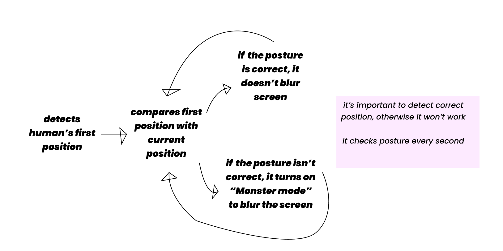
- Ask a human to keep a correct posture, get their right position of eyes and shoulders. Then check new positions every second and compare it with first positions. Also, detect arms and legs if it will be in a camera view.
I chose the second one, because it’s easier and faster to do.
Details
Let’s imagine logical part of this idea.
When a human keeps incorrect posture, positions of eyes and shoulders will decrease (on y). If y value will decrease, a screen will be blurred and vice versa. That’s simple.
I drew pistures with incorrect positions:
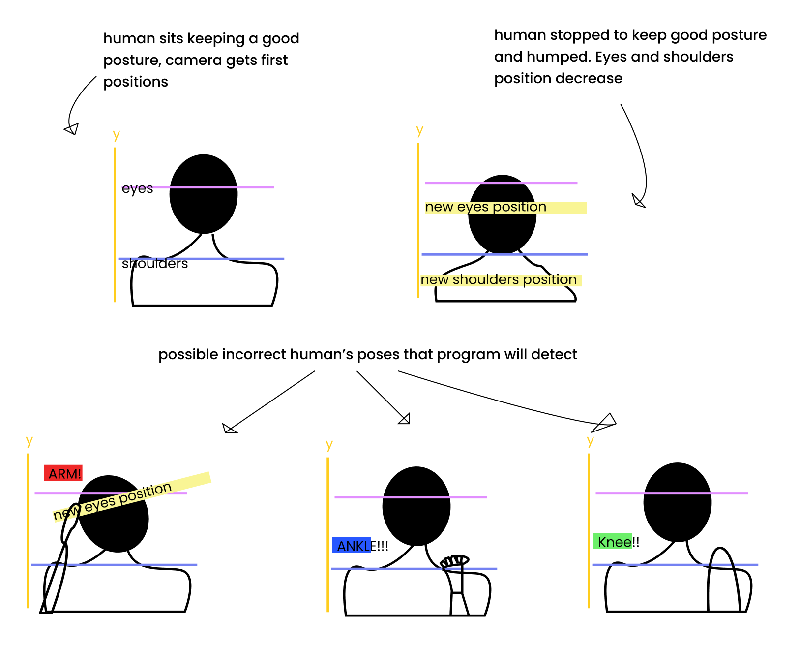
Blurrrrrrrrrrrrrrrrrrrr me baby please
I started code with two functions. One of them blurs the screen, the second one removes blur:
function blurScreen() { document.body.style.filter = 'blur(10px)'; document.body.style.transition= '0.9s'; } function removeBlur() { document.body.style.filter = 'blur(0px)'; }
It works like I wanted but doesn’t like I devised
The next step was to detect all needed body parts: right and left eyes, shoulders, wrists, knees and ankles. I did it, but there was a not tiny problem. Sometimes, camera detected wallpapers, shoulders and my right breast as ankles or knees, hahaha. .-.
So, it worked unstable and I decided to start with eyes detection.
New goal was — get the first right eye position when the human is sitting with good posture, then track eye when the human moves and check the difference between current eye position and default position. And to do it with left eye.
//Position of eyes after a human has pressed the button “start”. Default position. while (defaultRightEyePosition.length < 1) { defaultRightEyePosition.push(rightEye.y); }
//Compare default position with current position. If the difference more than 15, it means a person doesn't keep good posture and program calls the function that blurs screen. if (Math.abs(rightEye.y - defaultRightEyePosition[0]) > 15) { blurScreen(); }
//If the difference less than 15, it means a person is sitting with correct posture. if (Math.abs(rightEye.y - defaultRightEyePosition[0]) < 15) { removeBlur(); }
Cool! Despite the fact that it tracks only right eye, it works well like a monster in a dark forest where everyone wants to eat you!
You can believe me or maybe don’t, but there is all code we need for this. I decided it’s enough to track only one eye for the experiment. So, let’s design!
vissssual design
Maps
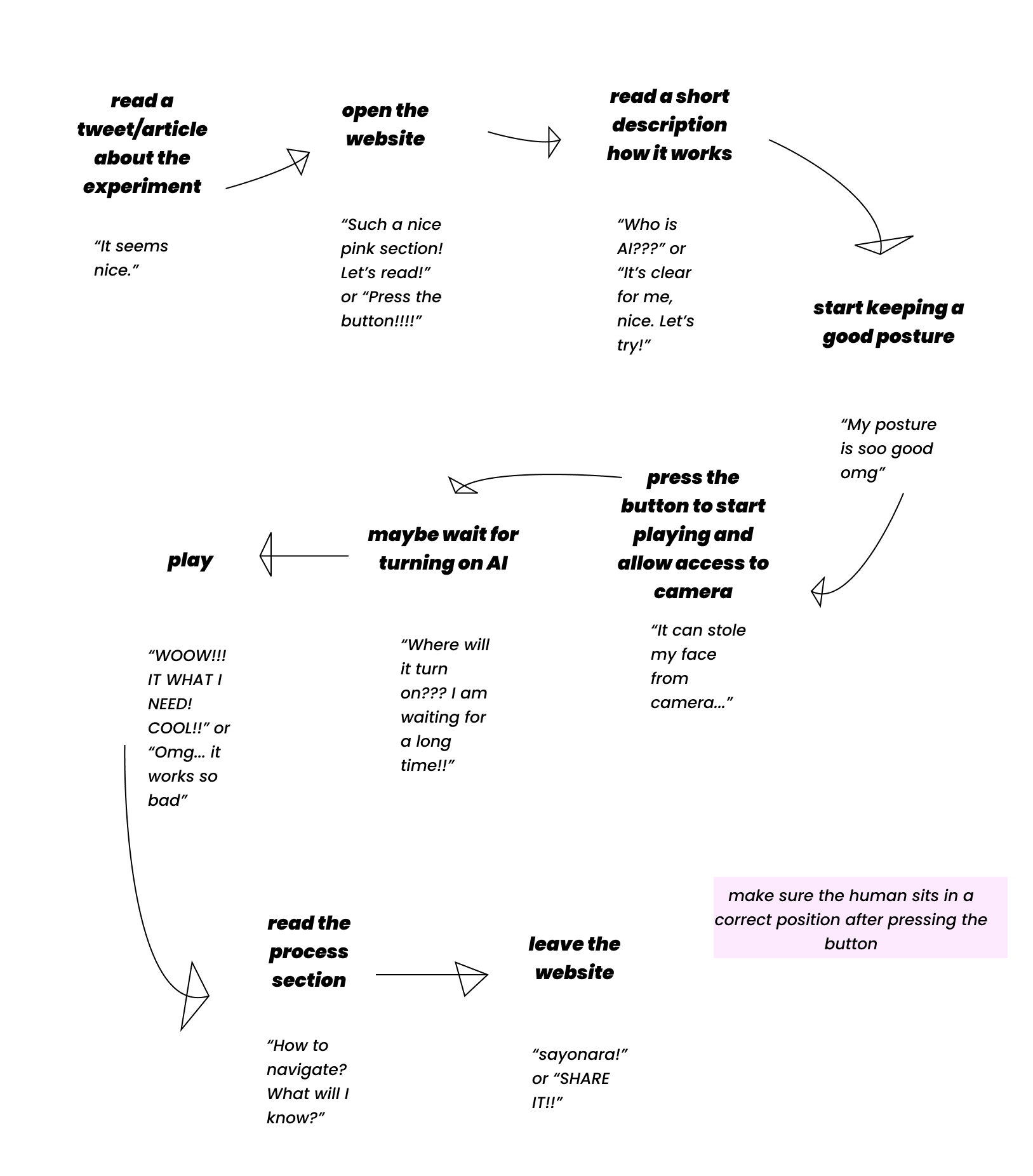
I drew two shemes. The first is called “AI Journey Map”, it describes program process. The second one is User Journey Map.
Site goals
- Show experiment
- Share work process
Description window
My visual design was started with the description window. I just drew a pink rectangle, liked it and decided to use rectangles for important information.
But before designing the desciption window, I highlighted moments I need to show here.
What should be in the window?
- What is it?
- How does it work?
- It doesn't stole personal information
- Reminder: keep a correct posture before start
- It can load for a long time
- Maybe “Made by”?
Eventually I considered that some points aren't important.
Version 31.10.2077
I had a few versions of how it can look:
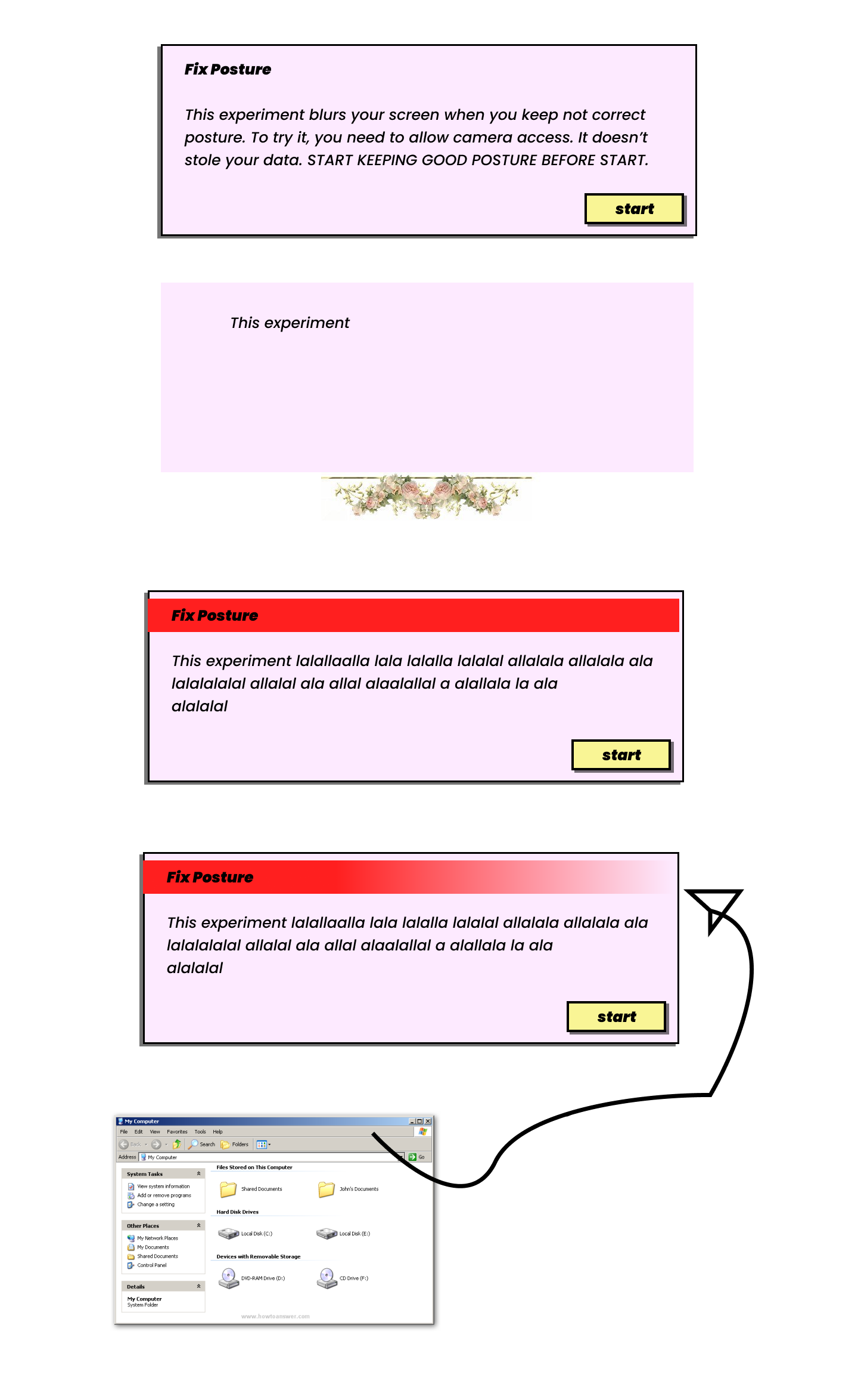
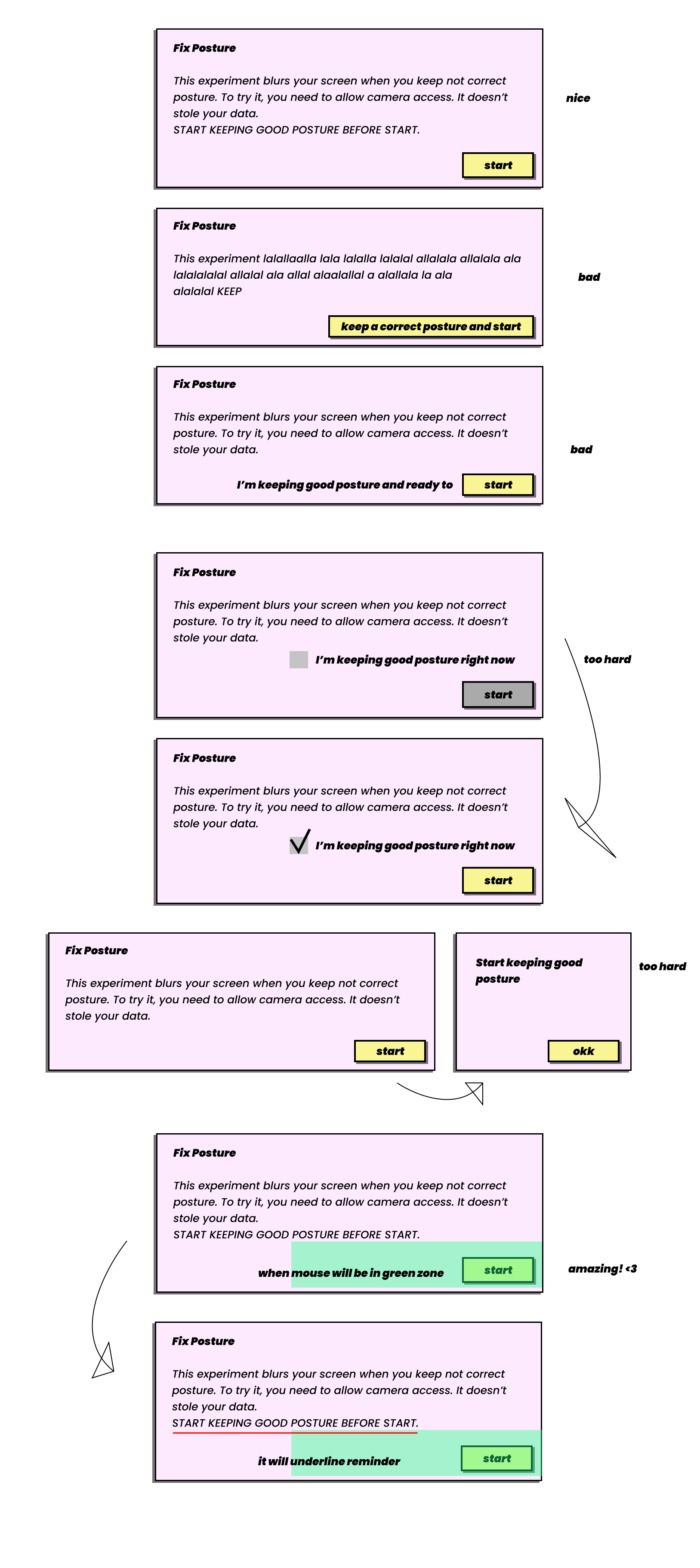
How to make a human to keep good posture before starrrt?
Evrything above looks great, of course. But I needed to make reminder more notable. I must make sure a human keeps good posture before start. There're some sketches:
Links
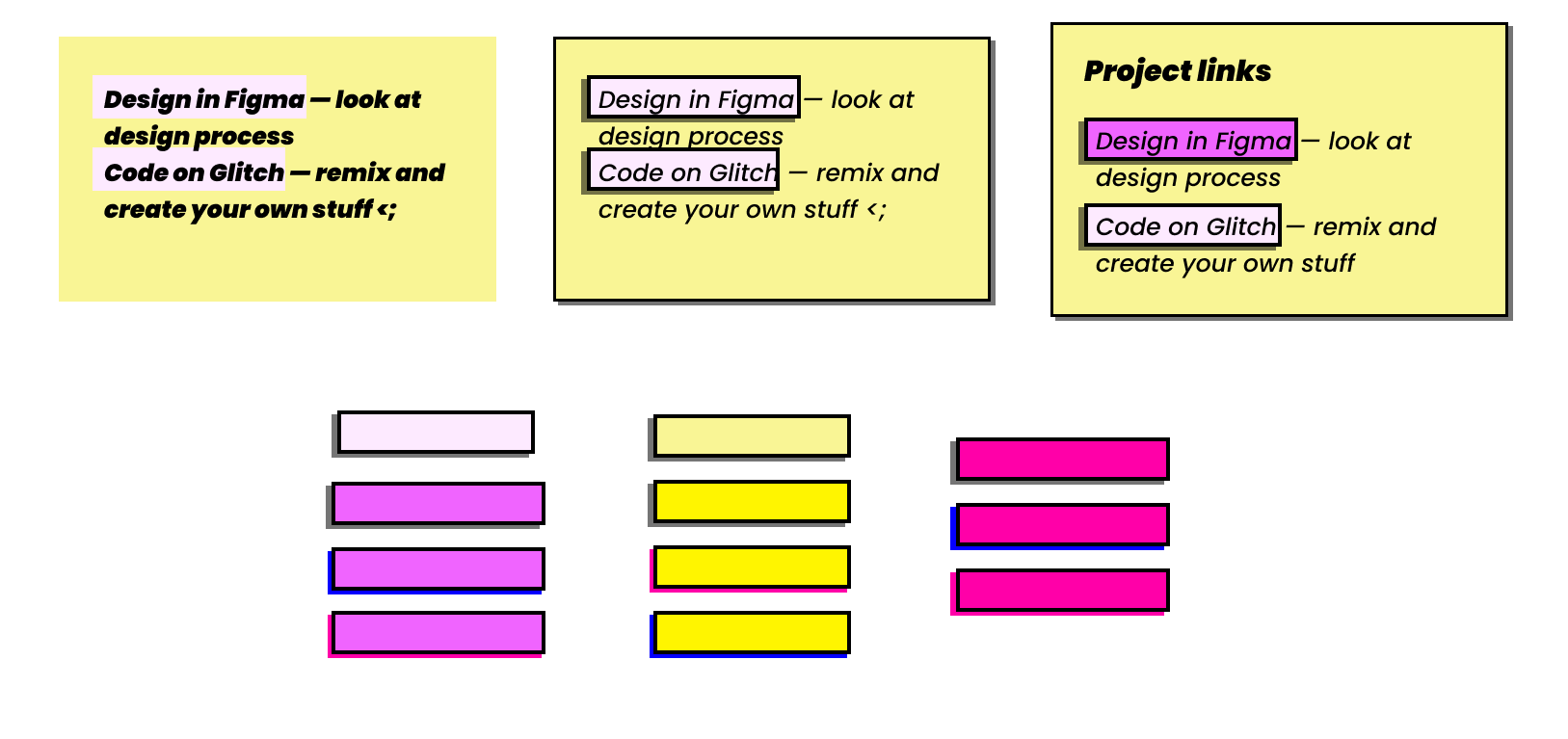
I made rectangle links like cards and buttons with shadows (shadows are my best friends in this project). Also, I thought about accent colors for mouse on hover. There were ideas to make a link's hover color brighter than initial color or use bright pink and blue. I chose bright red.
While working on link window, I decided to put header here.
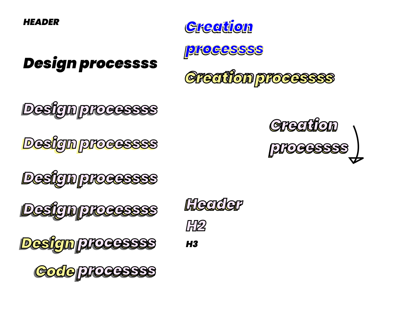
HEADers
I wanted to create something special, not just black big text. I experimented with color of shadows and stroke.
The arrow near “Creation process” was drawn accidentally.
You are in my LIST
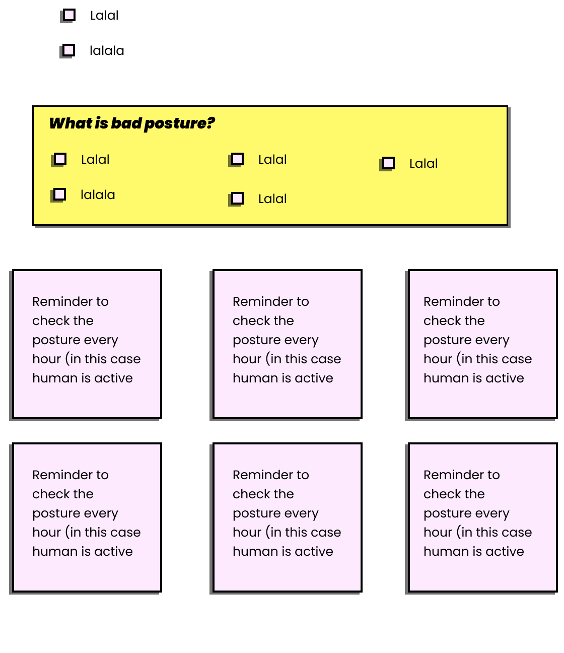
I experimented with link shape and decided to choose the first variant. But at the last moment, I changed my decision. When I was coding lists, I was surfing Internet how to put an image instead of default list-style-type and found that I can use interesting symbols, letters for it. Of course, I chose Japanese katakana.
Code window
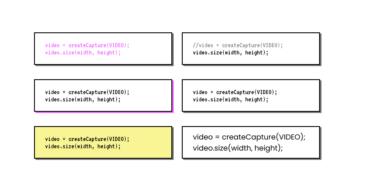
I picked rectangle for code window. There were variants with pink shadow and text or with yellow rectangle, they are too bright. Of course, for this window I used “very coder” (beautiful and pixel) font — VT323.
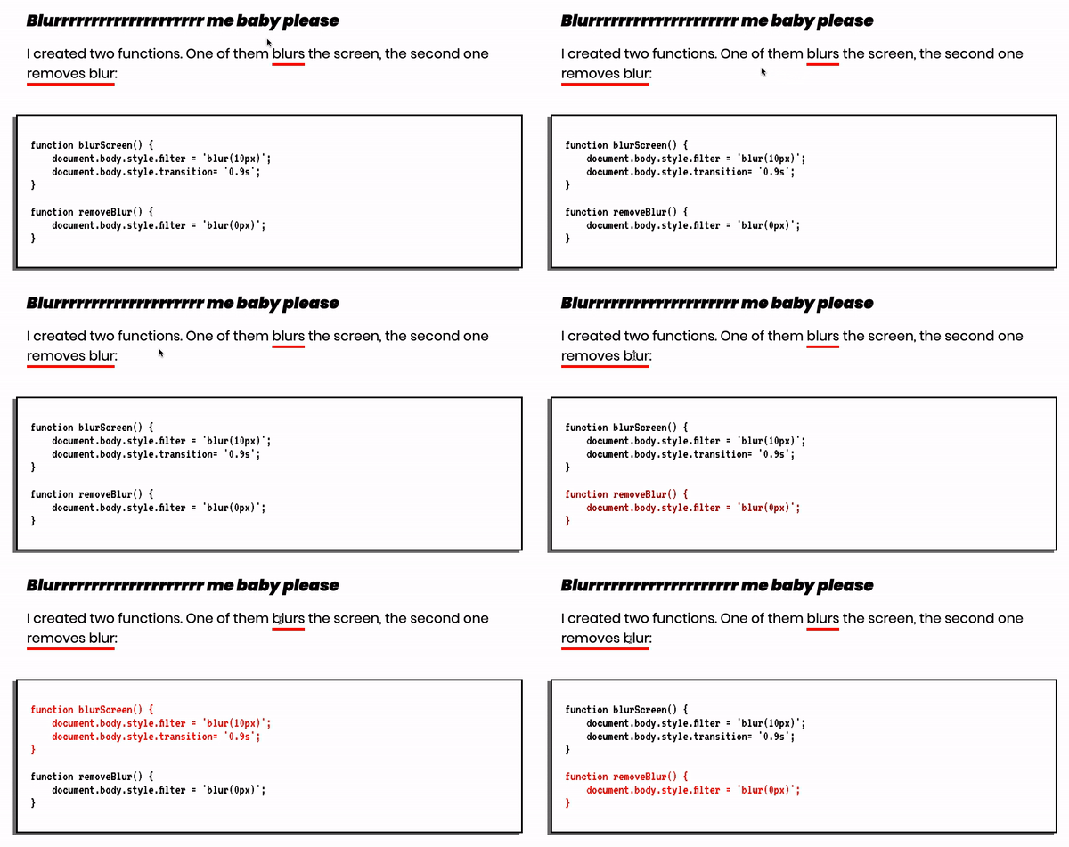
Haha, I just got a funny idea to use something like matrix digital rain instead of white windows with black border.
An UX experiment is in AI experiment. DOUBLE EXPERIMENT!
I just came up with a case where you explain code and a human has ability to follow in code what are you talking about.
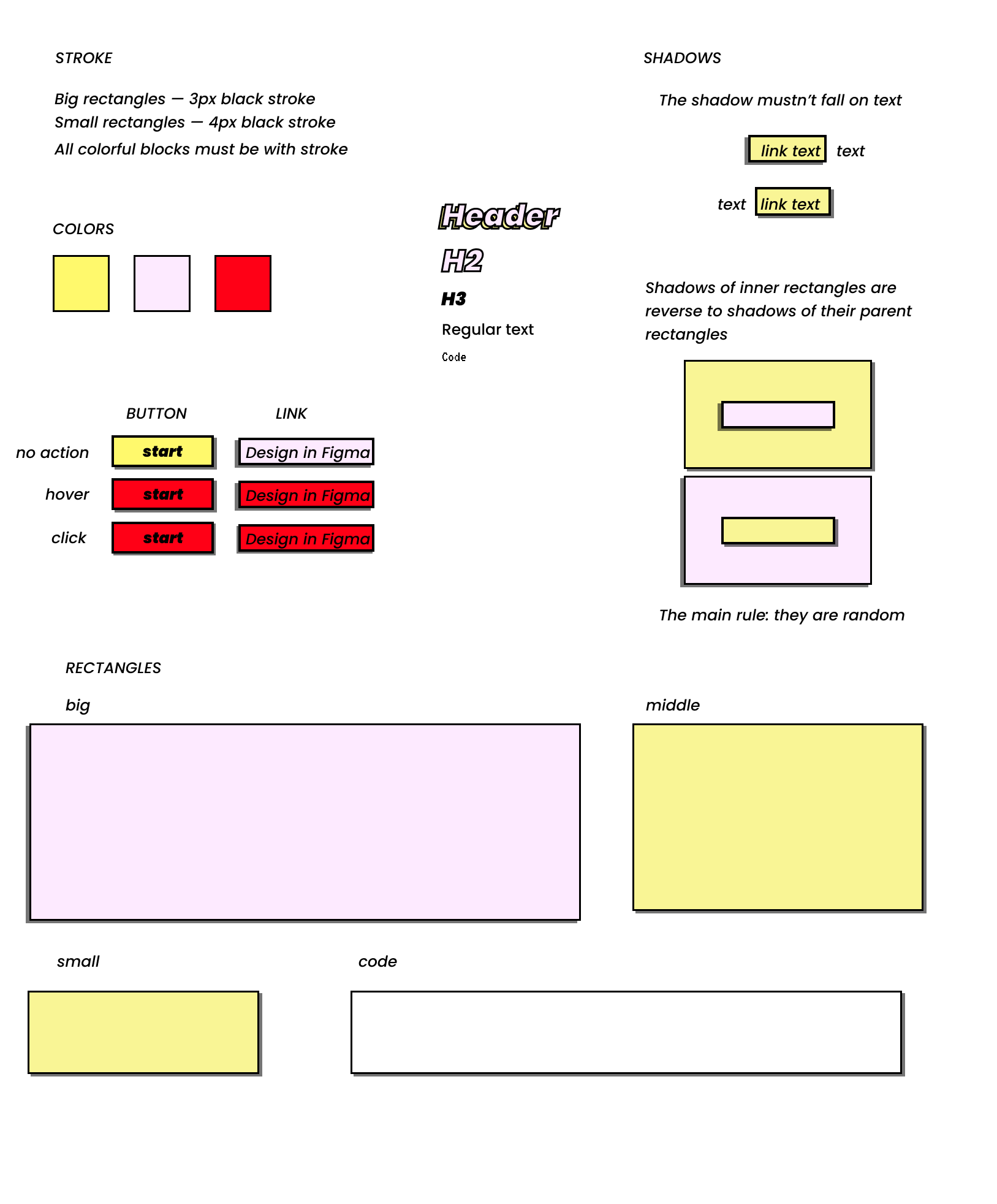
My little design system
In process, I collected the design system for this project.
It's not my one experiment. Check other. c;
Make me big — changes font based on your position in front of your computer. Made with TensorFlow.js PoseNet model.
Smile and like — a fictional social network where you need smile to like something. Made with face-api.js.
Mood-AI-Design — changes design based on your emotions. Made with face-api.js.
Thanks for reading. 🐢
Don't forget to create something by yourself and check open links with design and code. They are in the beggining. c: